


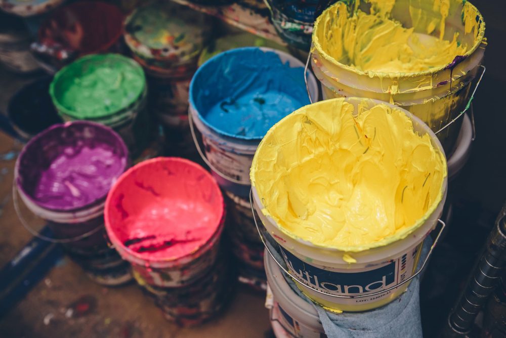
How to Select Ink Colours that Work Well Together
What is your favourite colour? Could it be that a better question is– What is your favourite colour combination? Colours, like many things, have relationships with other colours. Some are pleasing or dramatic, and some should simply be avoided.
GetBold offers some insight into colours that you might find inspiring. There are of course some common classic colour combos that are always safe to use depending on the style. But some colour selections are less conventional. These unconventional colour combinations might be an important part of what makes your t-shirt stand out from the rest.
Colours also represent styles in our culture. What colours or colour combinations remind you of a particular style or time period? What colours or colour combinations are more classic and withstand trends and fads?
With So Many Colour Options, Where Do You Begin?
Unless you begin by setting some parameters, it is easy to get overwhelmed. When you determine what message you’re trying to convey, you might find that the scope of possibilities becomes more finite. Different colours stand for different things, or subconsciously make us think of different things. Colour theory is, in itself, an extensive area of study.
Our Designers at GetBold can offer some guidance for you so that you can be sure to reinforce or add to your message and impact.
GetBold by Trying Less Conventional Colour Combinations
Two Different Greens: Our association with different greens are a result of our surroundings. Almost limitless combinations of greens can be found all around us in nature. Olives combined with cooler greens can be a beautiful feel.
Black and Gray: Sometimes less is more. Your message or statement might be so bold and striking in itself that you simply don’t want too much to get in the way or distract the viewer from that bold message.
Warm Red and Yellow: This can be a passionate colour combination. Saffron mixed with a golden yellow is an example of a colour combination that might help you communicate love, or a spiritual message, or just something you feel strongly about.
Beige and Maroon: May sound sort of tame, but with the right amount of contrast, this can be a great way to present some pretty interesting topics throughout time. Not only is beige a great shirt colour for many people, used in combination with maroon can set off an image and can create a great period piece.
Khaki or Forest Green and Pink: Pretty and unconventional, this is a unique combination. If the right tints are used for each colour, the contrast has a pleasing complimentary quality.
Orange and Blue: Another complementary colour combination that, if tints are properly selected, they can set each other off nicely. That said, this combo can get you in trouble and possibly produce to raw a look unless you select carefully.
Olive and Gold: This one is hard to beat for many categories. Some of that has to do with the use of metallic gold. In combination with a drab olive colour, this can be bold and rich-looking. And it is also an unconventional choice.
These are all examples of colour combinations that can do pretty well together, but it still depends on the style and your message. The team at GetBold can help you explore options and come up with suggestions that make sense and enhance the look.