


At GetBOLD, we love printing shirts, and we print a lot of shirts, and a lot of those shirts have text on them. That is why we come to you today pleading that you refrain from using any of the following four, overdone and misunderstood fonts.
How not to commit a Font Faux Pas:
Papyrus
Is your company producing pyramids or mummies? Because if not you have mis-chosen. Even in you happen to be recreating miniatures of the great pyramids I still wouldn’t recommend this one due to its proliferation. This font has wormed its way into everything from epitaphs to film posters. (Avatar anyone?) Papyrus is no longer associated with all things Egyptian, it is now associated with people that have no graphic design abilities or spatial awareness.
Impact
Impact lost its impact 10 years ago. So unless you have your own Tardis and you can wing your way back to 1999, you missed your moment. Perhaps you are selecting this font because you think you are balancing being cool with also being legible? Well, if you want legible go for Helvetica or Arial. If you want cool …um…well…you know what, just stick with legible.
Comic Sans MS
Comic sans was made for comic books. Like those little speech bubble things that contain dialogue. Unfortunately soon after, the font was used by schools for young children, which is understandable (not that I agree with it) but then it spread like a bad head cold, with restaurants, businesses, and hospitals getting on board. Once I saw comic sans on a wrestling t-shirt. It said “I kick ass”. Really? Who’s ass do you kick? 10 year olds? Let’s make a rule, okay? If you are old enough to brush your own teeth, choose a different font.
Curlz MT
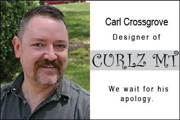
There is no okay time to use this font. I don’t care if you are advertising a hair salon that specializes in curling peoples hair, don’t do it. I’m serious here. Just don’t. I ask myself regularly why Curlz MT exists. It isn’t particularly easy to read nor is it aesthetically interesting. Carl Crossgrove, the man credited with designing it, must have taken inspiration from his facial hair (see above picture) because they are both hideous. Carl, you owe us all an apology. Really. You’ve wounded art.
In conclusion, fonts have a specific purpose, character and personality. They say a lot about you and your product. Choose wisely. And remember, whatever font you select, (or facial hair you grow) it will face harsh judgement from font nerds like me.
– Abby P., Extremely opinionated 14 year old daughter of the dude who owns this company